
90 Days to a Provider Analytics Dashboard for Salons and Barbers
90 Days to a Provider Analytics Dashboard for Salons and Barbers

A provider analytics dashboard measures each stylist or barber’s bookings, revenue, and retention side by side, chair by chair. Of everything it tracks, one number decides whether a chair is worth keeping: revenue per provider per month. If that number is flat or falling, no amount of Instagram traffic or five-star reviews fixes the underlying problem. Get that single metric moving and the rest of your business follows.
TL;DR:
- Revenue per provider per month is the most critical metric; keeping this number rising ensures overall business health.
- Daily checks should focus on booked hours and no-shows, while weekly reviews should monitor utilization, ticket averages, and retail attach rates.
- Connecting all systems through a unified platform guarantees real-time, accurate attribution of bookings, payments, and provider performance.
- Validating data accuracy involves cross-referencing revenue with bank statements and ensuring complete provider tagging for each appointment.
- Focusing on a core set of KPIs, such as revenue per chair and rebook rate, supports targeted actions like pricing adjustments or staffing shifts.
Table of Contents
- What Are Provider Analytics Dashboards, Exactly?
- What Should You Check Daily, Weekly, and Monthly?
- How Do You Turn Dashboard Charts Into Decisions?
- How Do You Get From Zero to a Working Dashboard in 90 Days?
- Why a Branded Platform Beats a Patchwork of Apps
- Can You Customize the Dashboard for Your Shop?
- What Data Privacy Rules Apply to Provider Analytics?
- How Does This Connect to Your Existing POS or Booking Software?
- Which Charts Actually Help You Make Decisions?
- How Do You Know Your Dashboard Numbers Are Right?
- What Kinds of Decisions Come Directly From This Data?
- What I’d Tell a New Shop Owner Overwhelmed by All This
- Ready to Put Your Provider Data on Autopilot?
- Sources
What Are Provider Analytics Dashboards, Exactly?
Provider analytics dashboards pull data from your booking system, point of sale, and payment processor into one screen that breaks performance out by person, not just by shop. Instead of a single “we did $18,000 this month” figure, you see that Marcus generated $6,200, Dana generated $4,900, and the new hire generated $1,100, still ramping up. That granularity is the entire point. A shop-wide average hides the fact that one chair is carrying the other three.
This is different from generic booking software reports, which usually stop at appointment counts and total revenue. A real provider-level dashboard shows you rebooking behavior, average ticket, and utilization per person, which is what actually tells you whether to raise someone’s prices, coach their upsell pitch, or have a hard conversation about their schedule.
Here are the seven numbers worth watching, with quick formulas you can run off any spreadsheet even before you own a dashboard:
- Average service ticket: total service revenue divided by number of services. Raise prices when this number sits flat for two or three months while demand stays strong.
- Revenue per provider/chair per month: total revenue attributed to that person, all services and retail combined. This is the number that determines if a chair earns its rent.
- Chair utilization and cuts per chair per day: booked hours divided by available hours. Below a moderate utilization rate signals a staffing or marketing gap, not a pricing problem.
- Rebook rate (within 48 hours of checkout) and pre-book rate: the percentage of clients who book their next visit before leaving the chair. This is the strongest early predictor of retention you have.
- No-show and late-cancel rate: tracked against your card-on-file policy. Shops that require a card on file typically see this number drop sharply.
- Retail attach rate: percentage of service tickets that include a retail add-on, and its dollar contribution to that provider’s total.
- Focus on new client acquisition costs and retention: what you spend to get a first-time client in the chair, and whether that client returns within a defined window.
The best-performing barbershops track revenue per chair, chair utilization, rebook rate, online booking percentage, and no-show rates as their core benchmark set, and tie each one to a specific weekly or monthly action rather than just reporting it.
What Should You Check Daily, Weekly, and Monthly?
Checking every metric every day burns time and produces decision fatigue. Cadence matters more than coverage. Here’s a rhythm that actually gets followed:
- Daily (owner or shift lead, five minutes): cuts per chair so far, any no-shows, and today’s bookings versus available capacity. This tells you if today needs a walk-in push or a rebooking call.
- Weekly (owner, 15 minutes): utilization by provider, average ticket by provider, and retail attach rate. This is where you catch a slump before it becomes a quarter.
- Monthly (owner, 30 minutes): rebook rate and revenue per chair. This is when pricing changes, schedule shifts, or staffing decisions actually get made.
- Quarterly (owner, full review): a complete KPI pass to decide whether to add a chair, drop a service, or renegotiate commission splits.
This structure mirrors the daily, weekly, monthly, and quarterly cadence that operators use to tie each check to a concrete action instead of just admiring a chart.
Pro Tip: Put the weekly 15-minute review on your calendar as a recurring appointment with yourself, same time every week. Dashboards fail not because the data is bad but because nobody looks at it on a schedule.
How Do You Turn Dashboard Charts Into Decisions?
A dashboard that just sits there displaying numbers is a wall decoration. The value shows up when a chart changes what you do next week.
Start with the peak-hours heatmap, a grid showing booking density by hour and day. If Tuesday mornings are dead and Saturday afternoons are overbooked, that’s not a marketing problem, it’s a staffing problem. Shift a provider’s hours, offer a Tuesday discount, or stop taking Saturday walk-ins past 3pm.
Staff leaderboards work best as a coaching tool, not a scoreboard for public shaming. If one provider’s average ticket is 30% below the shop average, that’s a conversation about upsell technique or pricing confidence, not a performance write-up posted on the break room wall. Leaderboards should feed commission conversations and one-on-one coaching, never public comparison.
Use the dashboard to spot mispriced services too. If a service consistently books at full capacity weeks out, it’s underpriced. Run a small experiment: raise that one service by $5 to $10 for 30 days and watch rebook rate and volume before deciding if it sticks. Some salon analytics platforms now generate this kind of pricing recommendation automatically, flagging services with abnormally high booking pressure relative to price.
A few things worth checking in every price test:
- Did volume actually drop, or did clients absorb the increase?
- Did rebook rate hold steady?
- Did the provider’s total monthly revenue rise despite fewer bookings?
If revenue per chair improves despite slight booking changes slightly, the price increase worked. That’s the entire test.
How Do You Get From Zero to a Working Dashboard in 90 Days?
You don’t need a perfect system on day one. You need a sequence that builds real data first, then acts on it.
- Days 0 to 30, instrument: connect your point-of-sale system, booking calendar, and payment processor so every transaction attributes to a specific provider. Turn on card-on-file for every new booking. Without this step, every KPI below is guesswork.
- Days 31 to 60, optimize: roll out a 48-hour rebook script every provider uses at checkout, and build a simple retail attach routine, one suggested add-on per service type. Watch these two numbers weekly; they move fast when done consistently.
- Days 61 to 90, compound: run your full price-list review using the heatmap and provider scorecards you’ve now accumulated. Decide on chair count, commission splits, or service menu changes based on 60 to a few months of real numbers instead of gut feel.
If you’re not ready to buy a dashboard yet, a notebook or a basic spreadsheet tracking these same seven KPIs gets you most of the benefit. The habit of checking weekly matters more than the sophistication of the tool. Independent operators running a single chair can absolutely do this in a shared Google Sheet before ever paying for software.
Why a Branded Platform Beats a Patchwork of Apps
Most instrumentation problems aren’t caused by missing metrics, they’re caused by disconnected systems. A booking app, a separate payment processor, and a spreadsheet for retail sales means someone has to manually reconcile three data sources every week, and that someone eventually stops doing it.
A platform built specifically for barbers and beauty professionals closes that gap by design. When your branded website, booking system, and mobile app all run through the same provider record, every booking, payment, and rebooking event attributes automatically, no manual matching required.
That kind of integration typically gives you:
- Provider-level pricing control, so each barber or stylist can set their own rates without breaking the reporting structure.
- Automatic booking-to-payment attribution through integrated payment processing.
- Native mobile apps that capture client behavior data your booking widget alone would miss.
- Clean, provider-tagged reporting from day one, with no separate reconciliation step.
Here’s a concrete example: you raise one provider’s haircut price by $8 in week one. By the weekly review, you can see whether their booking count held and whether their revenue per chair rose. By the monthly check, you know if the rebook rate stayed stable. That entire loop, from price change to confirmed impact, closes in about four weeks when your booking, payment, and provider attribution all sit in one system.
Can You Customize the Dashboard for Your Shop?
Not every provider needs to see the same numbers. A solo barber renting a chair wants their own revenue, rebook rate, and ticket average, nothing else. A five-chair salon owner wants that same view stacked across all providers, plus a shop-wide utilization trend.
Most modern dashboards let you set which KPIs surface by default for each role. Owners typically get the full financial picture, including commission math and revenue per chair. Individual providers usually get a narrower view: their own bookings, tips, retail attach, and rebook rate, without visibility into what coworkers earn. That separation matters for team morale as much as for privacy.
Time range customization matters just as much as role-based views. A stylist checking today’s schedule doesn’t need a 12-month trend line cluttering the screen. Being able to toggle between daily, weekly, and rolling 90-day views on the same metric keeps the dashboard useful for both quick checks and quarterly planning.
Custom alert thresholds are worth setting up if your platform supports them. A no-show rate crossing 15%, or a rebook rate dropping below 30%, triggers a flag before the trend becomes a real problem instead of after. The goal is a dashboard that fits how your specific shop operates, not a generic template built for a 40-chair franchise when you run three chairs solo.
What Data Privacy Rules Apply to Provider Analytics?
Provider dashboards handle two kinds of sensitive information: client personal data and provider earnings data, and both carry real risk if mishandled.
Client-side, you’re storing names, phone numbers, payment methods, and appointment history. Card-on-file policies, while great for cutting no-shows, mean you’re now responsible for handling stored payment credentials correctly. Use a payment processor that manages PCI compliance directly rather than storing raw card numbers yourself; that’s exactly why integrated processors like Square or Stripe exist inside booking platforms instead of shops building their own payment storage.
Provider-side, earnings and performance data is genuinely sensitive information among coworkers. A stylist’s monthly revenue, tip average, and rebook rate can create real tension if visible shop-wide. Set access permissions so providers see their own numbers and owners see everyone’s, rather than defaulting to an open dashboard everyone can browse.
Data retention is worth a policy decision too. Keeping years of granular client visit history has value for retention analysis, but it also means more sensitive data sitting in one place. Decide how long you actually need detailed records versus aggregated summaries, and set that retention window deliberately instead of just letting data accumulate indefinitely by default.
How Does This Connect to Your Existing POS or Booking Software?
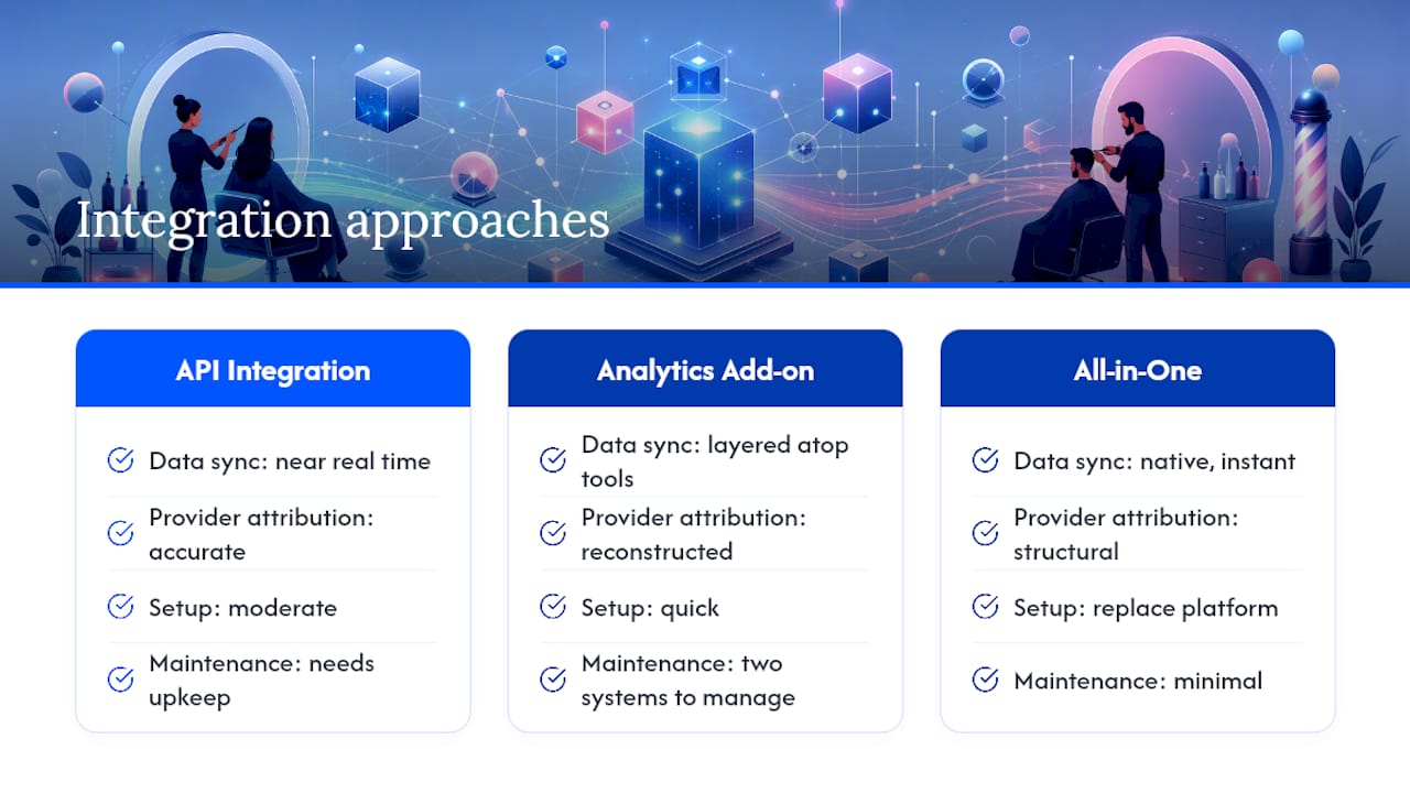
Integration quality determines whether your dashboard reflects reality or shows a delayed, partial picture. The core question to ask any system: does it pull data automatically, or does someone need to export and upload it manually?
Direct API integration between your booking calendar, point-of-sale terminal, and payment processor is the standard to aim for. When these three systems share data natively, a completed appointment updates revenue, provider attribution, and payment status in near real time, no end-of-day data entry required.
Some standalone analytics add-ons integrate with existing salon software to layer staff attribution and revenue leakage detection on top of whatever booking tool you already use, which works if you’re not ready to switch platforms but want better reporting immediately. The tradeoff is you’re managing two systems and hoping they stay in sync.
The cleaner path for most independent operators is a platform where booking, payments, and reporting were built together from the start, so there’s no integration to maintain or break during a software update. That’s the difference between bolting analytics onto disconnected tools versus running a system where provider attribution is structural rather than reconstructed after the fact.
Whichever route you take, confirm your provider attribution survives edge cases: walk-ins rung up by a different staff member than who performed the service, split tickets between two providers, and rebooked appointments moved between chairs. These are exactly the scenarios where patched-together systems lose accuracy.
Which Charts Actually Help You Make Decisions?
Dashboards tend to lean on a handful of visualization types, and each one answers a different question.
Line charts show trends over time, revenue per chair across 12 months, for instance. They’re the right tool for spotting seasonal patterns or a slow decline that a single week’s snapshot would miss.
Heatmaps show density across two dimensions at once, most commonly day of week against hour of day for booking volume. This is the visualization that actually drives staffing decisions, since a bar chart of “bookings by day” hides which hours within that day are the problem.
Leaderboard tables rank providers against each other on a chosen metric, average ticket, rebook rate, or total revenue. These work best sorted by the metric you’re actively trying to improve that month, not just total revenue, which tends to just reward whoever has the most seniority.
Bar charts compare discrete categories, service types by revenue, for example, and they’re the clearest way to see which services deserve a price increase versus which ones are pure loss leaders.
The mistake most operators make is trying to read every chart every day. Pick one chart per cadence: the daily view is a number (bookings today), the weekly view is a bar chart (utilization by provider), and the monthly view is a line chart (revenue per chair trend). Match the chart type to the decision it needs to support, not the other way around.
How Do You Know Your Dashboard Numbers Are Right?
Bad data is worse than no data, because it produces confident wrong decisions. Before you act on any dashboard number, run a quick sanity check.
Cross-reference one week’s total revenue shown on the dashboard against your bank deposit or payment processor statement for that same week. If they don’t match within a small margin, something upstream isn’t syncing correctly, usually a provider attribution error or a payment method not connecting to the booking record.
Check that every completed appointment actually has a provider tag. A surprising number of dashboard discrepancies trace back to walk-ins or phone bookings entered without a staff member assigned, which then get excluded from provider-level totals entirely rather than showing up as an error.
Spot-check retail sales attribution specifically. Retail attach rate is one of the easiest numbers to get wrong, since a product sold at checkout sometimes attributes to whoever rang up the sale instead of the provider who actually recommended it during the service.
That’s often a sign the calculation is using a default or placeholder value rather than pulling live data. Real metrics fluctuate; suspiciously stable numbers deserve a second look before you trust them for a pricing or staffing decision.
What Kinds of Decisions Come Directly From This Data?
The real test of any dashboard is whether it changes a decision you’d have made anyway. A few patterns show up repeatedly once shops start watching provider-level data closely.
A provider with high utilization but a below-average ticket is usually undercharging relative to demand. The fix isn’t more marketing, it’s a price increase, since the calendar is already full.
A provider with strong rebook rate but low new-client volume often has a referral or visibility problem, not a skill problem. That’s a case for a targeted local marketing push rather than a pricing change.
A sudden dip in one provider’s retail attach rate, isolated to just that person while shopwide retail stays flat, usually points to a specific behavior change, maybe they stopped mentioning the retail line during checkout, worth a quick coaching conversation rather than a broader retail strategy overhaul.
Consistently high no-show rates concentrated on a specific day or time slot, rather than spread evenly across the week, often means that slot is being booked by first-time clients who haven’t built commitment yet. Requiring card-on-file specifically for first-time bookings in that slot tends to fix it faster than a blanket policy change.
What I’d Tell a New Shop Owner Overwhelmed by All This
Ignore the urge to track twenty metrics. Track the core seven, weekly, without fail, and you’ll outperform a shop staring at forty charts nobody checks. A dashboard earns its subscription cost the moment it saves you more time than a spreadsheet, usually once you’re managing three or more providers and the manual reconciliation starts eating an evening. Below that, a notebook works fine. Start small, get the habit right, then let the tool grow with you.
— Service
Ready to Put Your Provider Data on Autopilot?
Everything in the 90-day playbook above, connecting POS, booking, and payments so every dollar attributes to the right chair, is exactly what Exclusively’s appointment and booking system is built to handle from day one. Your branded website, native mobile app, and booking calendar share the same provider record, so revenue per chair, rebook rate, and retail attach all show up correctly without you reconciling three separate exports every Sunday night.
If you’re still deciding how your shop stacks up against other booking platforms, the pricing page breaks down which plan includes provider-level reporting at your chair count, and the appointments page shows exactly how attribution flows from booking to payment to your weekly numbers. Start there, connect your first provider, and check your dashboard next Monday.