
Salon Website Examples That Turn Visitors Into Bookings
Salon Website Examples That Turn Visitors Into Bookings
The salon websites that actually book more clients share three priorities: striking portfolio photography, an always-visible “Book” button, and a clear service menu with transparent pricing. Everything else, the color scheme, the font pairing, the fancy hover effects, is decoration around those three jobs.
If you’re a salon owner who needs a site live this month, pick a template with a booking plugin already built in and swap in your own photography. If you’re a designer briefing a custom build for a premium brand, use the examples below as a style reference, then lock down the booking flow and service menu before touching the visual polish. Getexclusively builds branded websites, booking, and mobile apps as one connected system, which is worth knowing before you stitch together five separate tools that don’t talk to each other.
Two things to settle before you open a single template:
- Who books you, and how do they decide? A blowout bar and a bridal color specialist need different homepages.
- What’s your one conversion action? Every page should point at booking, not at “learn more about us.”
Key Takeaways
Salon websites that convert visitors into bookings prioritize visible booking access, transparent service pricing, and portfolio photography that matches the salon’s actual price point.
| Point | Details |
|---|---|
| Booking visibility wins | Keep a “Book Now” CTA in the header and repeated near every service listing, not buried on one page. |
| Price transparency reduces anxiety | Use “starting at” pricing tied to stylist level so clients know what to expect before they call. |
| Photography must match positioning | Luxury brands need editorial single shots; portfolio-forward salons need dense, filterable galleries. |
| Mobile booking is not optional | Test your calendar and payment flow on an actual phone, not just a desktop preview. |
| Branded platforms consolidate the stack | Getexclusively combines branded websites, booking, native apps, and Square/Stripe payments under one login instead of several disconnected tools. |
Table of Contents
- Salon Website Examples Grouped by Style
- Which Design Patterns Actually Drive Bookings?
- Which Website Features Actually Matter for Bookings?
- How Do You Turn an Example Into a Live Site?
- How Getexclusively Delivers on These Priorities
- Does Your Salon Site Actually Work on a Phone?
- Why Does Site Speed Matter for a Salon Website Specifically?
- What Makes a Call to Action Actually Get Clicked?
- What SEO Basics Actually Move the Needle for a Salon?
- Get a Branded Website Built Around Your Booking Flow
- Sources
Salon Website Examples Grouped by Style
Every strong salon site fits roughly one of five design personalities. Pick the one that matches your pricing and clientele, then borrow its structure rather than trying to blend all five.
Luxury and editorial
- Full-bleed hero with a single stylist portrait. No text overlay beyond a logo and one line of copy. This works for salons charging premium rates where the photography needs to carry the entire first impression.
- Serif headline over a matte black background. Pairs a refined serif for headings with a simple sans-serif for body copy, a combination that reads as expensive without saying a word about price.
- Muted, desaturated photo grid. Instead of loud before/afters, editorial sites use quiet, magazine-style shots. Fits color specialists and bridal stylists more than quick-service barbershops.
- Appointment request instead of instant booking. Some luxury sites deliberately slow the funnel with a request form, which filters for serious clients willing to wait for the right stylist.
- Press and feature badges in the footer. A small strip of “as seen in” logos does more trust work here than a testimonial carousel.
Clean and minimal
- White space as the main design element. Two-value palette (a neutral base, one accent color), generous margins, and a type scale that doesn’t shout. Reproducible on nearly any Squarespace or Webflow template.
- One accent color used only for CTAs. Every “Book Now” button uses the same shade, and nothing else on the page does, so the eye never has to guess where to click.
- Single-column service list with icons. Instead of a dense table, minimal sites break services into short blocks with a small icon, a name, and a starting price.
- Sticky top navigation with a persistent booking link. The nav bar never disappears when scrolling, which matters more than almost any other single decision on a minimal layout.
- Soft-shadow cards for testimonials. Minimal doesn’t mean stark. A little depth on review cards keeps the page from feeling cold.
Portfolio-forward
- Instagram-style masonry grid on the homepage. Built for salons whose work is visually dramatic (extensions, color correction, editorial cuts). Webflow’s salon template library has several strong versions of this pattern.
- Before/after sliders on individual service pages. Reduces booking anxiety by showing the actual range of outcomes rather than one flattering shot.
- Filterable gallery by service type. Lets a visitor click “balayage” or “curly cuts” and see only relevant work, which shortens the path to booking for a specific need.
- Video reels embedded above the fold. Short looping clips of a cut or color process outperform static photos for engagement on younger-skewing clienteles.
- Stylist-tagged portfolio images. Each photo credits the stylist who did the work, doubling as a soft staff-bio feature and a booking nudge toward a specific person.
Booking-first
- Booking widget embedded directly on the homepage, not behind a separate page. The fewer clicks between landing and confirming a slot, the fewer visitors bail.
- Service-and-price dropdown that flows straight into a calendar. No detour through a general contact form.
- Mobile-first single-thumb booking flow. Buttons sized for a thumb, not a mouse cursor, with date and time selection stacked vertically.
- Deposit or card-on-file prompt built into the flow. Reduces no-shows and works well when paired with a booking platform that also processes payment.
- Waitlist and cancellation notifications as a visible feature, not a hidden setting, which reassures busy clients that a full calendar isn’t a dead end.
Product-led and retail-integrated
- Shop tab beside the Book tab in the main nav. Positions retail as equal to services rather than an afterthought buried in the footer.
- Bundled service-and-product packages shown as a single line item with one price, useful for salons pushing take-home color maintenance or treatment kits.
- Membership and package pages with a comparison layout. Three tiers, side by side, mirrors how spas and med-spas present memberships.
Pro Tip: Build your photo shot list before you touch a website builder: one wide hero shot of the space, six to eight portfolio images showing range (not just your best cut), two staff portraits per stylist, and one detail shot of your product retail area. Shoot everything at a minimum of 2,000 pixels wide so it still looks sharp on a 4K monitor, then compress for web so pages load fast. A portfolio gallery built around a tight, intentional shot list will always outperform one stuffed with fifty unsorted phone photos.
Which Design Patterns Actually Drive Bookings?
A handful of patterns show up across nearly every well-performing salon site, and they’re not accidental.
Hero treatment depends on your positioning. Full-bleed images fit luxury and portfolio-forward brands; a boxed hero with a visible booking widget fits booking-first sites that want the CTA doing work immediately, not just the photo.
CTA strategy matters more than almost anything else on the page. A persistent header button, or a sticky “Book” bar on mobile, keeps the action available no matter how far someone scrolls. Design roundups repeatedly flag booking prominence and mobile flow as the deciding factor between a site that converts and one that just looks nice.
Portfolio and before/after galleries reduce the biggest source of booking hesitation: not knowing what you’ll actually look like walking out. A slider that shows a real range of outcomes, not just one perfect result, builds more trust than a highlight reel.
- Use a two-value palette: one neutral base, one accent color reserved for buttons and links.
- Match your type scale to your price point: bold modern sans-serif for accessible pricing, a refined serif accent for premium positioning.
- Show stylist credentials and specialties near the booking button, not buried on a separate “About” page.
- Put testimonials near the service they reference, not in one generic block at the bottom.
Trust signals close the gap between browsing and booking. Stylist headshots with a name and specialty, a handful of specific testimonials, and any press mentions do more persuasive work than a stock “our story” paragraph.
Which Website Features Actually Matter for Bookings?
Style choices are reversible. Missing functionality costs you clients. Prioritize these:
- Mobile-first booking in one tap. If a client has to pinch-zoom to find the calendar, you’ve already lost them.
- A service menu with level-based pricing. Salons commonly list a “starting at” rate tied to stylist seniority, so a junior stylist’s balayage and a master colorist’s balayage show different prices with a short note on why. That structure, seen on menus like FiveOneSeven Salon’s detailed service list, sets expectations before anyone picks up the phone.
- Staff profiles with specialties and real availability, not just a name and headshot.
- Membership and package pages, especially for spas and salons selling maintenance plans.
- Visible cancellation policy and calendar sync, so clients know the rules before they book, not after they’re charged a fee.
- Integrated payments, whether that’s Square or Stripe, so deposits and no-show protection happen automatically instead of over a phone call.
- Basic local SEO signals: a real address, embedded map, and a name that matches your Google Business Profile exactly.
Pro Tip: Filter stylist level and appointment length as primary options in your booking flow, not an afterthought buried in a dropdown. Salons that make stylist tier and sample availability primary filters tend to convert more qualified bookings, because the client self-selects into the right price bracket before they ever talk to you.
How Do You Turn an Example Into a Live Site?
Pick a style, then work through this before opening a builder:
- Define your audience and price position. Luxury, minimal, portfolio-forward, booking-first, or product-led, choose based on who actually pays your rates, not what looks coolest.
- List your must-have booking features. Deposit collection? Multiple stylists? Package sales? This decides your platform.
- Write the photo brief. One hero, six to eight portfolio shots, two staff portraits per stylist, all at 2,000 pixels wide minimum.
- Choose your build path. A template plus a booking plugin gets you live fast and cheap, but you’ll manage two or three separate logins for hosting, booking, and payments. A branded platform like Exclusively’s custom websites costs more upfront but ships website, booking, and app under one login and one brand.
- Set a timeline. A template build typically runs two to three weeks from photos to launch. A custom branded site runs six to eight weeks but usually includes app and payment setup in the same timeline.
How Getexclusively Delivers on These Priorities
Getexclusively builds fully branded websites, native iOS and Android apps, and integrated booking under one login, which solves the “five disconnected tools” problem most template builds create.
- Provider-level control over pricing, availability, and service descriptions.
- Native mobile apps that carry your brand, not a marketplace logo, on a client’s home screen.
- Built-in Square and Stripe payment processing tied to the same booking calendar.
Branded apps paired with a fully owned website give multi-stylist salons a direct channel for repeat bookings instead of routing clients through a third-party marketplace every time.
Case studies and specific author credentials for this space are still being compiled by our editorial team.
Does Your Salon Site Actually Work on a Phone?
Most salon site traffic arrives on a phone, and a booking flow that works fine on a laptop can quietly fail on mobile. Test it the way a client would: standing in a parking lot, one thumb, spotty signal.
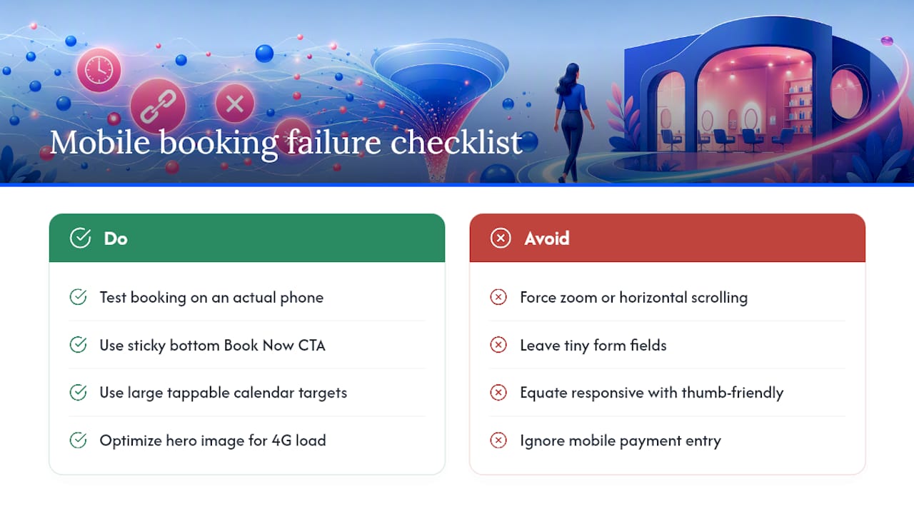
The biggest mobile failure point is the calendar widget. Some booking plugins render a full desktop calendar that gets squeezed into a phone screen, forcing tiny tap targets and horizontal scrolling. If a client has to zoom in to hit the right date, you’ve added friction at the exact moment they were ready to commit.
Sticky mobile CTAs solve part of this. A “Book Now” bar that stays fixed to the bottom of the screen as someone scrolls through your portfolio keeps the action one thumb-tap away, no matter how far down the page they’ve scrolled reading reviews or looking at before/after shots.
Test these specifically on an actual phone, not just a browser’s mobile preview: form field size (can you tap it without hitting the wrong field), calendar date selection, payment entry for deposits, and how long it takes for your hero image to load on a mid-tier connection. A hero image that’s beautifully sharp on a monitor but takes eight seconds to load on 4G will lose bookings before a client ever sees your work.
If you’re comparing platforms, ask specifically how booking renders on mobile, not just whether the site is “responsive.” Responsive and genuinely thumb-friendly aren’t the same thing.
Why Does Site Speed Matter for a Salon Website Specifically?
Salon sites live and die on photography, which is exactly what makes them slow. A hero image, a portfolio grid, and a few before/after sliders can easily add up to megabytes of uncompressed images, and every extra second of load time is a client who closes the tab and books somewhere else instead.
Compress before you upload, not after. Export portfolio images at web resolution (roughly 2,000 pixels on the long edge is plenty for full-bleed heroes) and run them through a compression step so file sizes drop without visible quality loss. Most modern site builders handle this automatically, but it’s worth checking rather than assuming.
Limit auto-playing video on the homepage to one, if any. Video looks great in a portfolio section, but stacking three autoplay clips above the fold is one of the fastest ways to tank load speed on a mobile connection.
Lazy-load your portfolio grid so images below the fold load only as a visitor scrolls to them, instead of loading fifty photos the instant the page opens. This alone can cut initial load time dramatically on image-heavy portfolio-forward sites.
Finally, keep your booking widget lightweight. A booking flow that loads its own separate calendar library on top of your site’s existing scripts can double page weight on the exact page where speed matters most, the one with the “Book Now” button on it.
What Makes a Call to Action Actually Get Clicked?
The strongest CTA on a salon site says what happens next, not just “click here.” “Book Your Color Consultation” outperforms a generic “Book Now” because it names the specific action a visitor is about to take.

Placement beats wording almost every time. A CTA buried at the bottom of a long About page gets ignored no matter how well it’s phrased. A CTA repeated in the header, after the portfolio gallery, next to each service listing, and in the footer gives a visitor a chance to convert the moment they’re ready, wherever they happen to be on the page.
Use one primary action per page. If a homepage has a “Book Now” button, a “Call Us” button, a “Join Our Newsletter” form, and a “Follow on Instagram” link all competing for attention, none of them win. Pick booking as the primary action everywhere except pages built specifically for something else, like a contact page.
Match the CTA to the reader’s stage. A first-time visitor browsing your portfolio might respond better to “See Availability” than a harder “Book Now,” while a returning client who already knows your work can go straight to “Rebook With [Stylist Name].”
Urgency works when it’s true. “Only 2 slots left this week” converts because it’s specific and real, not because urgency language is inherently persuasive. A fake countdown timer on a page with wide-open availability erodes the exact trust you’re trying to build.
What SEO Basics Actually Move the Needle for a Salon?
Local search intent drives most salon traffic, which means your SEO priorities look different from a typical business site. Someone searching “balayage near me” wants a fast answer, not a blog post.
Claim and fully complete your Google Business Profile with the exact same business name, address, and phone number that appears on your website. Inconsistency between your site and your profile confuses search engines and can quietly hurt your local rankings.
Name your service pages the way clients actually search, not the way your menu is internally organized. A page titled “Balayage Hair Color” outperforms one titled “Color Services” for search visibility, because it matches the specific term someone types into Google.
Write unique meta descriptions for each service page instead of letting a builder auto-generate the same generic line across your whole site. A meta description that names the service and mentions “book online” gives searchers a reason to click your result over a competitor’s.
Embed a map and list your service area explicitly, including neighborhood names your clients would use, not just your city. This helps you show up for hyperlocal searches that a city-only listing might miss.
Finally, keep your service menu in text on the page, not locked inside an image or PDF. Search engines can’t read pricing or service details trapped in a graphic, which means your entire menu becomes invisible to search no matter how well-designed it looks.
A Publisher’s Take on Salon Website Design
Most salon sites fail on structure, not style. Owners obsess over color palettes while their booking button is buried three clicks deep. Get the priorities right first: visible booking, honest pricing, real photography. Curious how a branded platform handles this? Book a call and see for yourself.
— Service
Get a Branded Website Built Around Your Booking Flow
Templates get you live fast, but they leave you managing separate logins for hosting, booking, payments, and eventually an app, none of which share your branding or your data. Getexclusively is the alternative: one platform that gives you a fully branded website, native iOS and Android apps, integrated Square and Stripe payments, and provider-level control over your own pricing and availability, all under your own name instead of a marketplace logo.
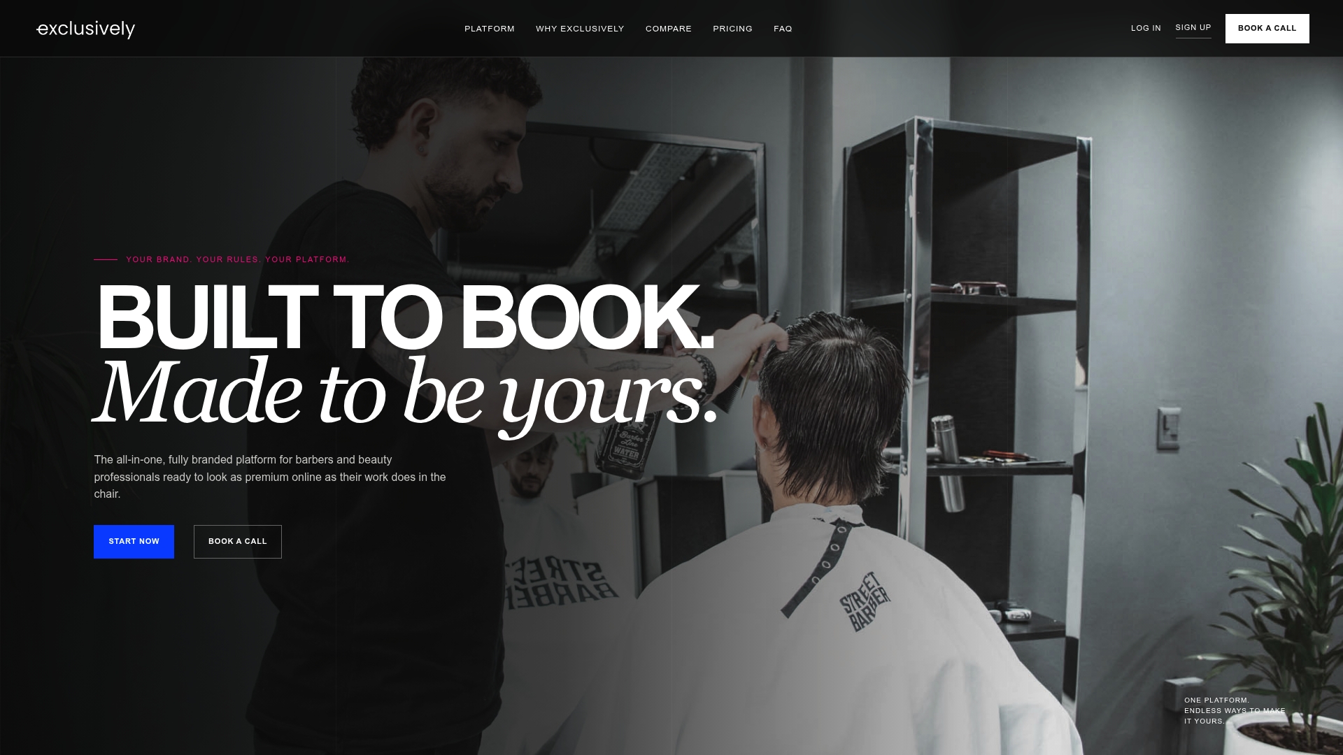
That matters most for multi-stylist salons and suite owners who want clients rebooking through their own app rather than shopping around on a third-party directory. Every stylist sets their own services and prices, but the brand stays consistent across web, mobile, and checkout. Compare Getexclusively against SQUIRE or against Booksy if you’re evaluating options side by side, or head straight to the pricing page to see what a branded website, booking system, and app actually cost against piecing together separate tools. If you’d rather talk it through first, book a demo and walk through your specific booking flow before you commit to anything.
Sources
- 35 Best Hair Salon Website Examples 2026 - Colorlib
- Hair Salon Price List Doreen | Hair By I Service Menu
- Salon Services – FiveOneSeven Salon